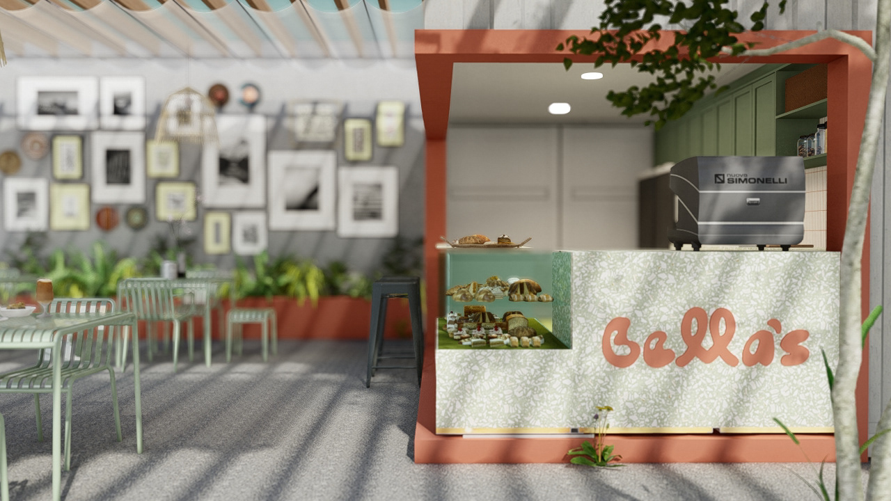
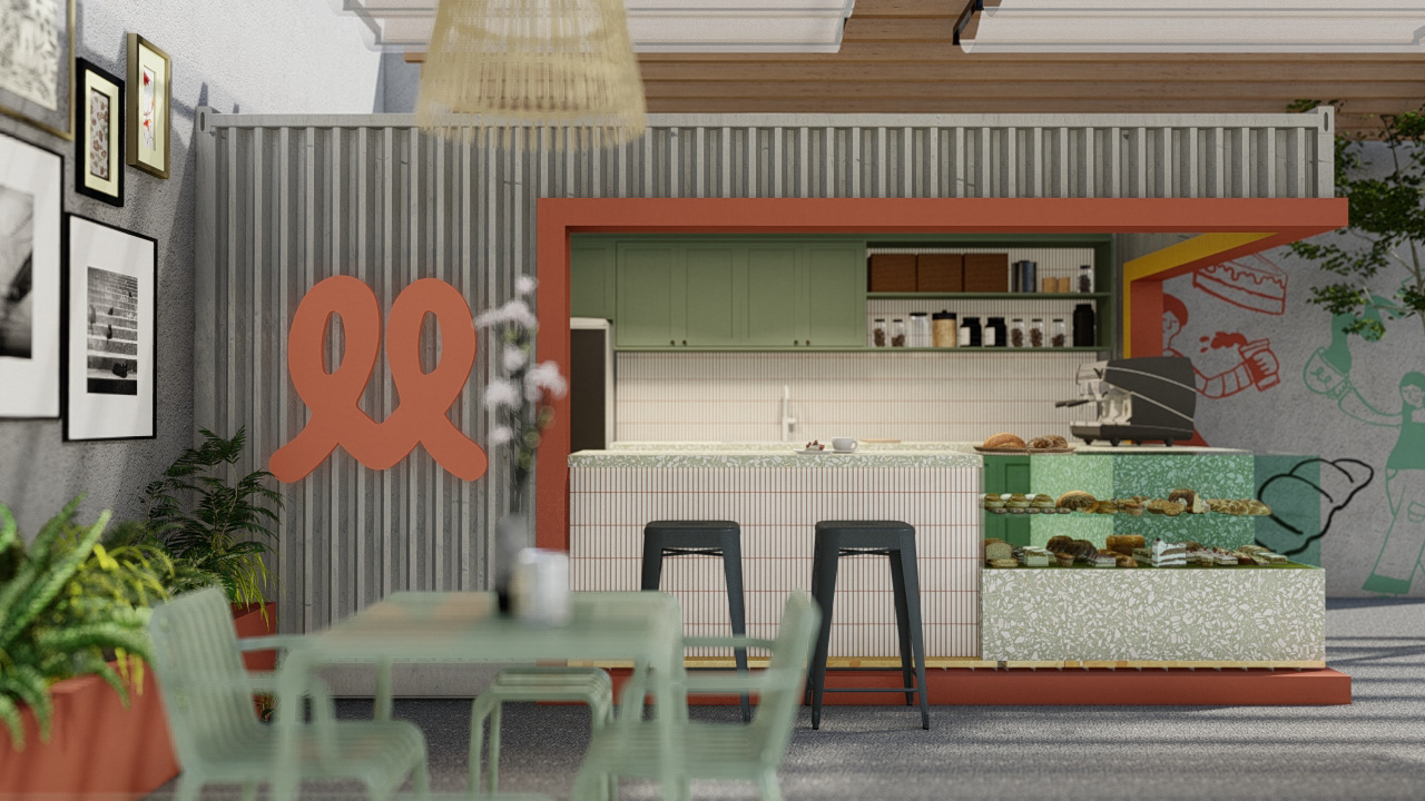
Bella's Cafe is a charming alfresco café situated in a neighborhood of Oroquieta City, Philippines.
The business is named after the only girl “apo” in the family, Bella.
The business is named after the only girl “apo” in the family, Bella.
—
Scope of Work:
Visual Identity
Visual Identity
Logo
Color Palette
Typography
Imagery
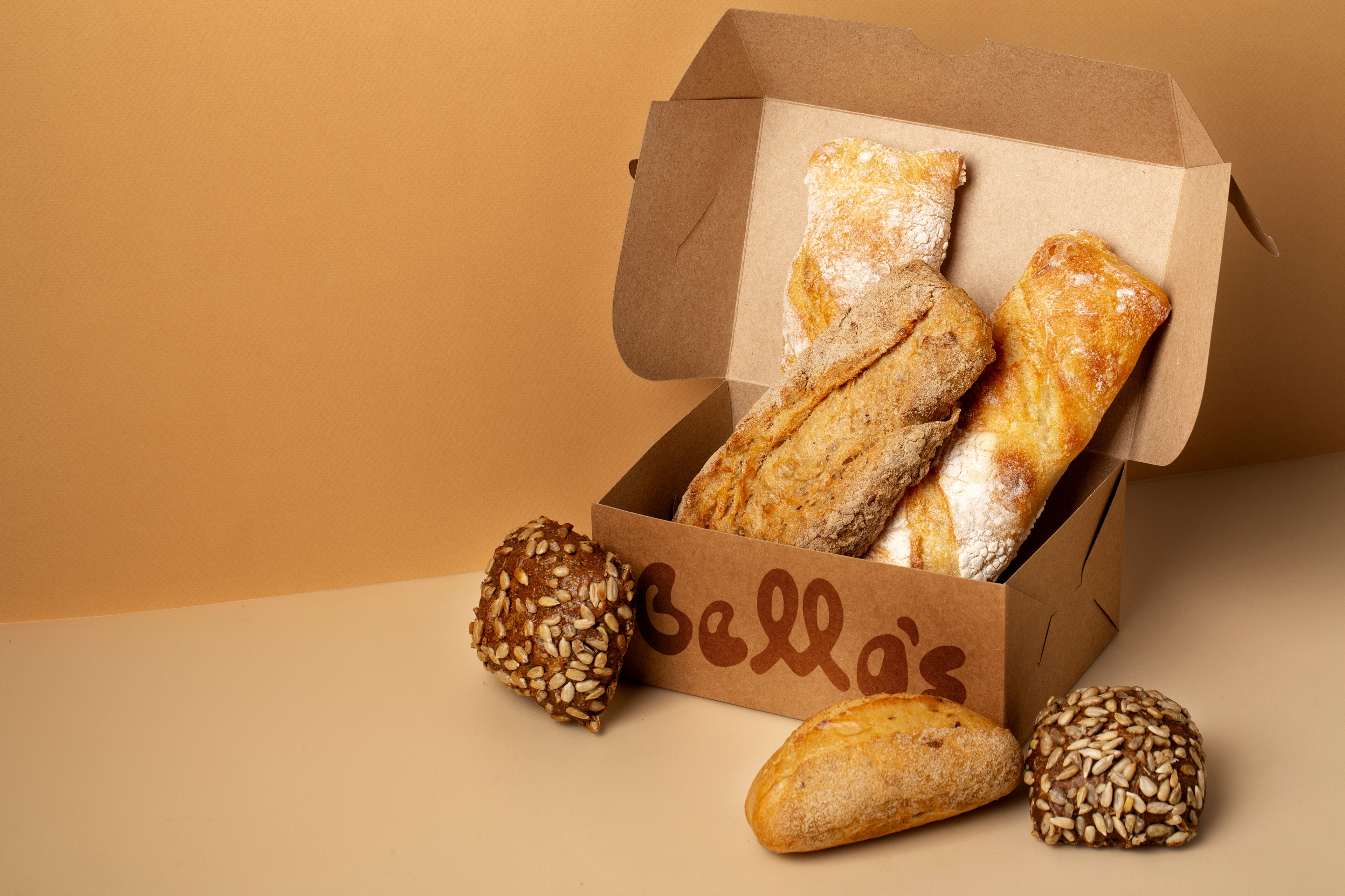
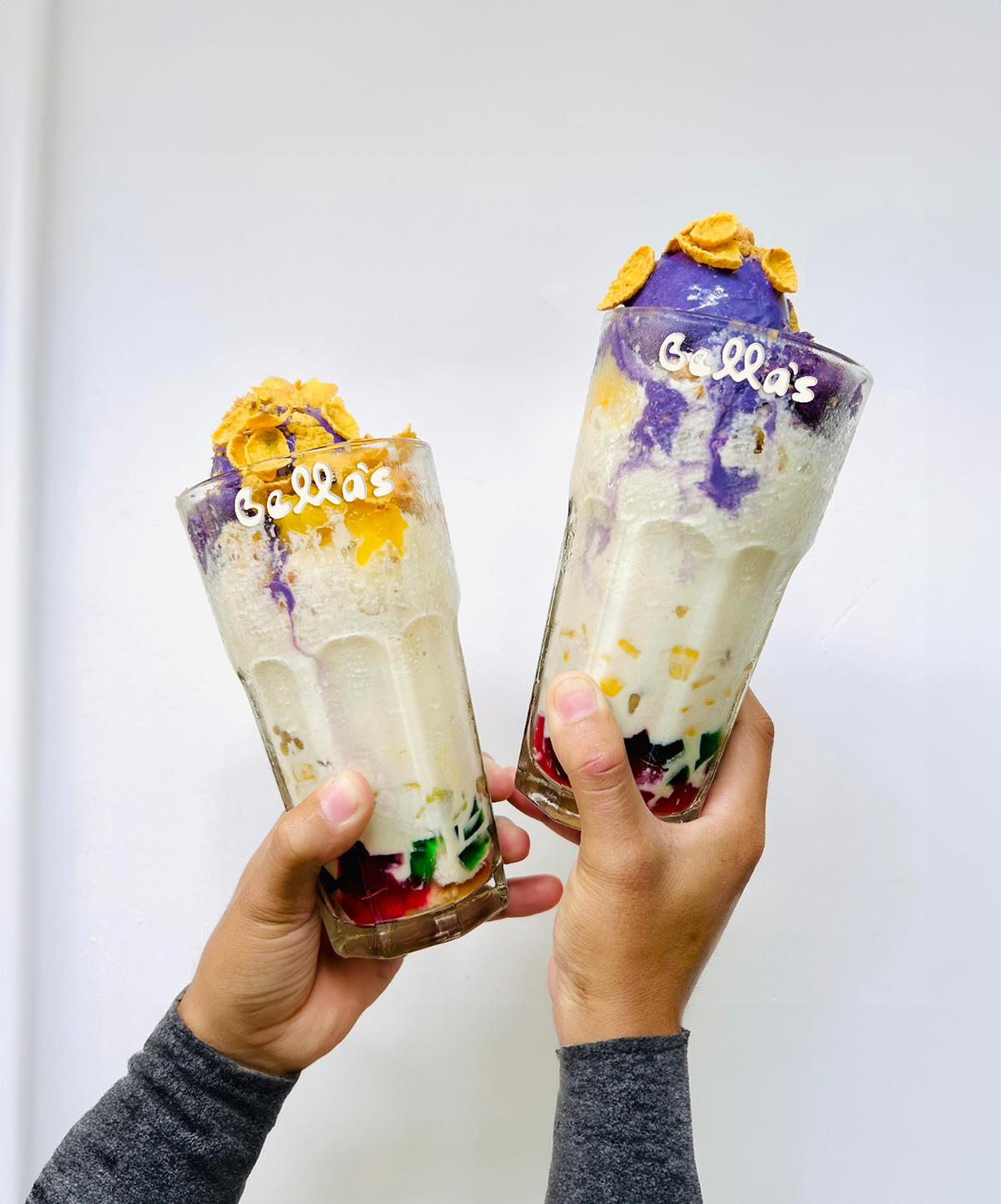
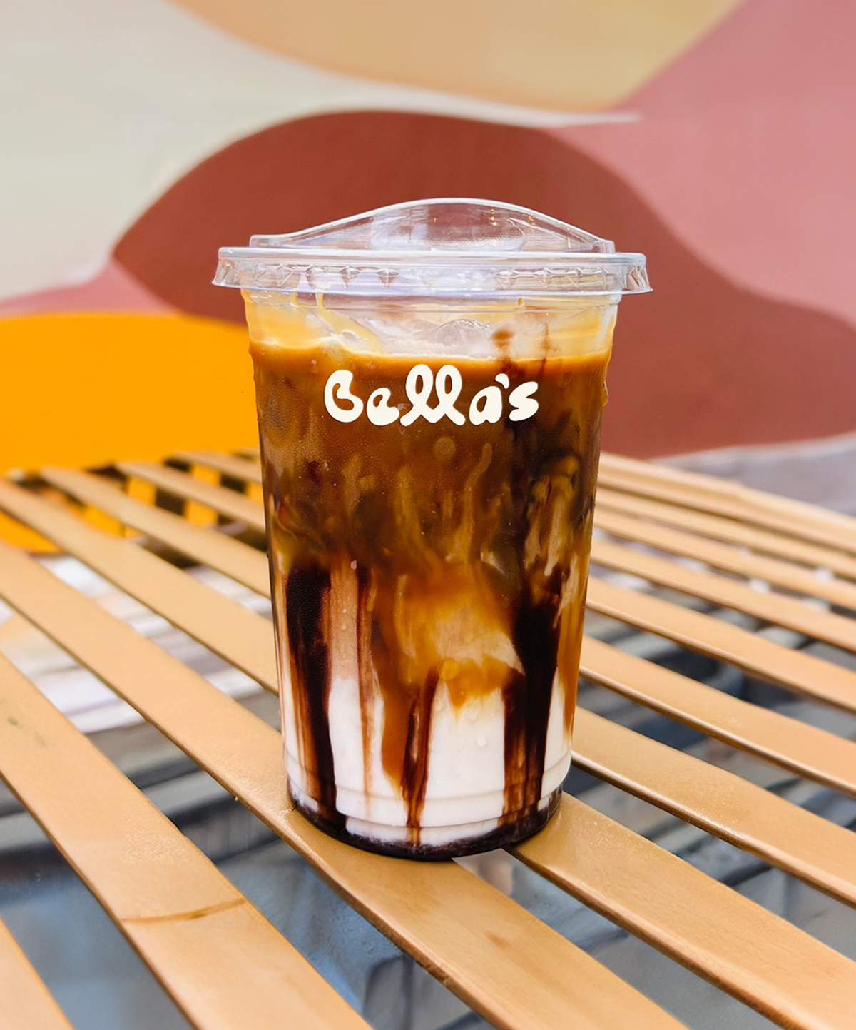
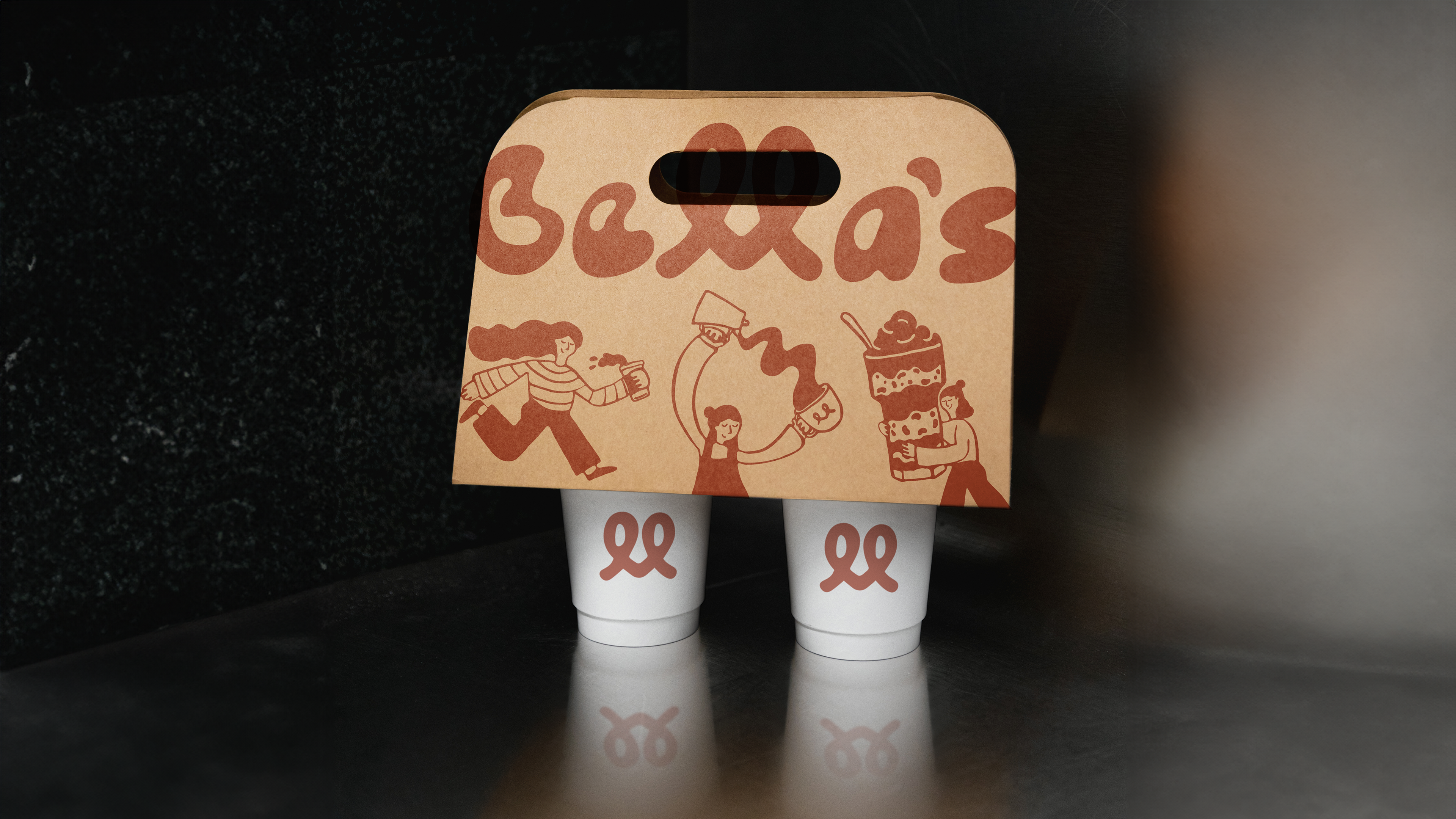
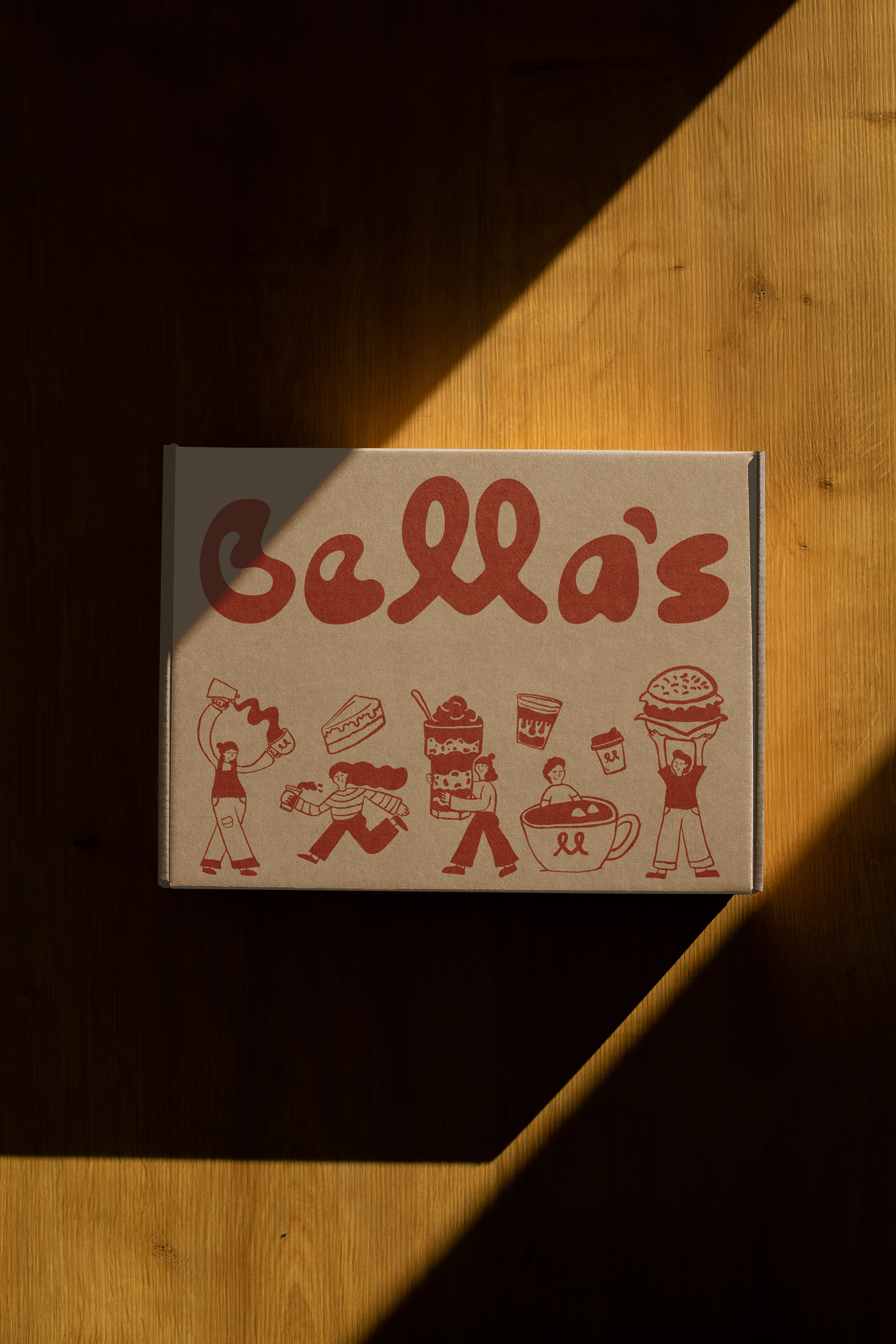
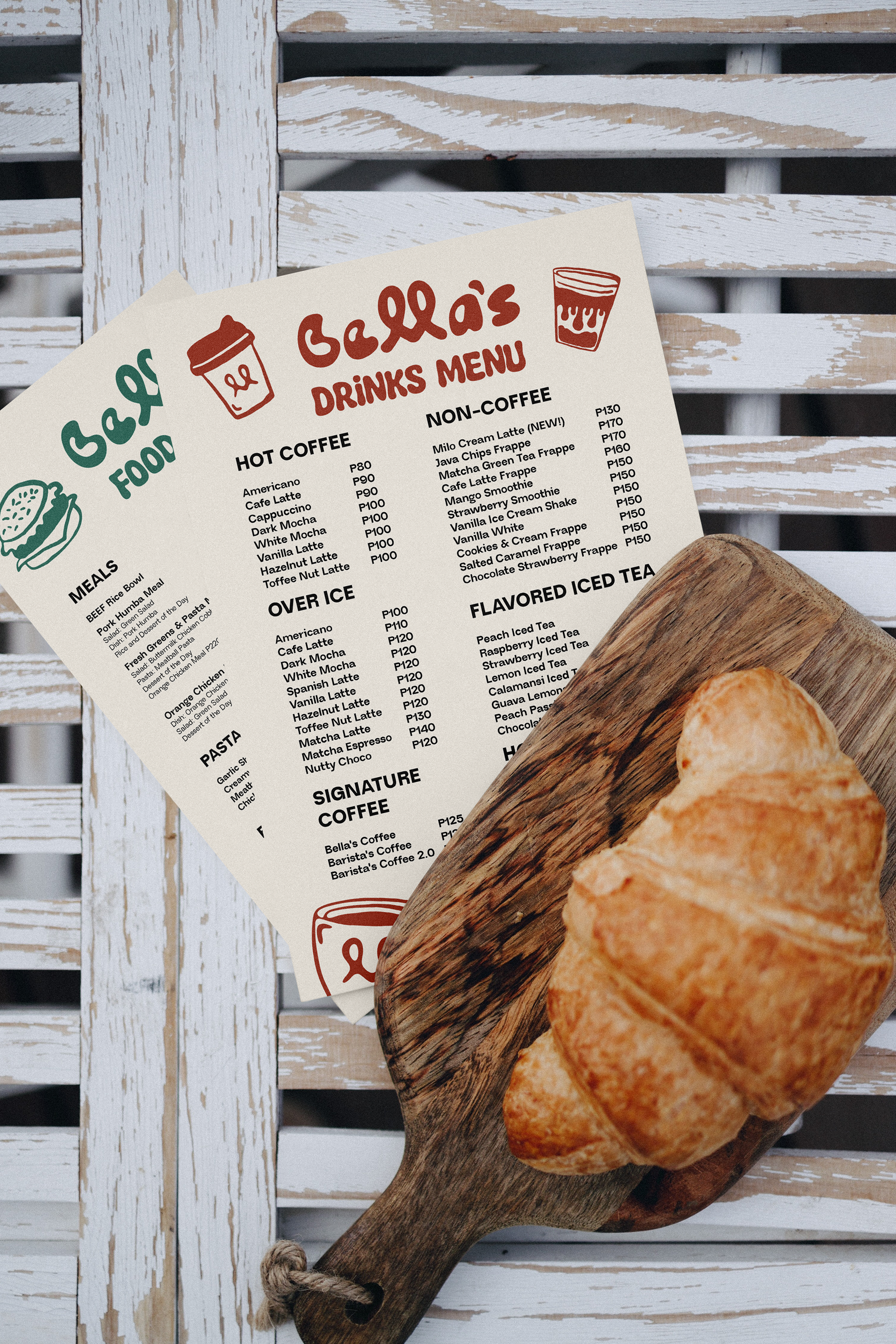
Bella’s Cafe logo is the main representation of the brand, giving a cozy and warm vibe through the use of a hand drawn and playful custom type.
Wordmark: This is the main logo primarily used for digital and print materials.
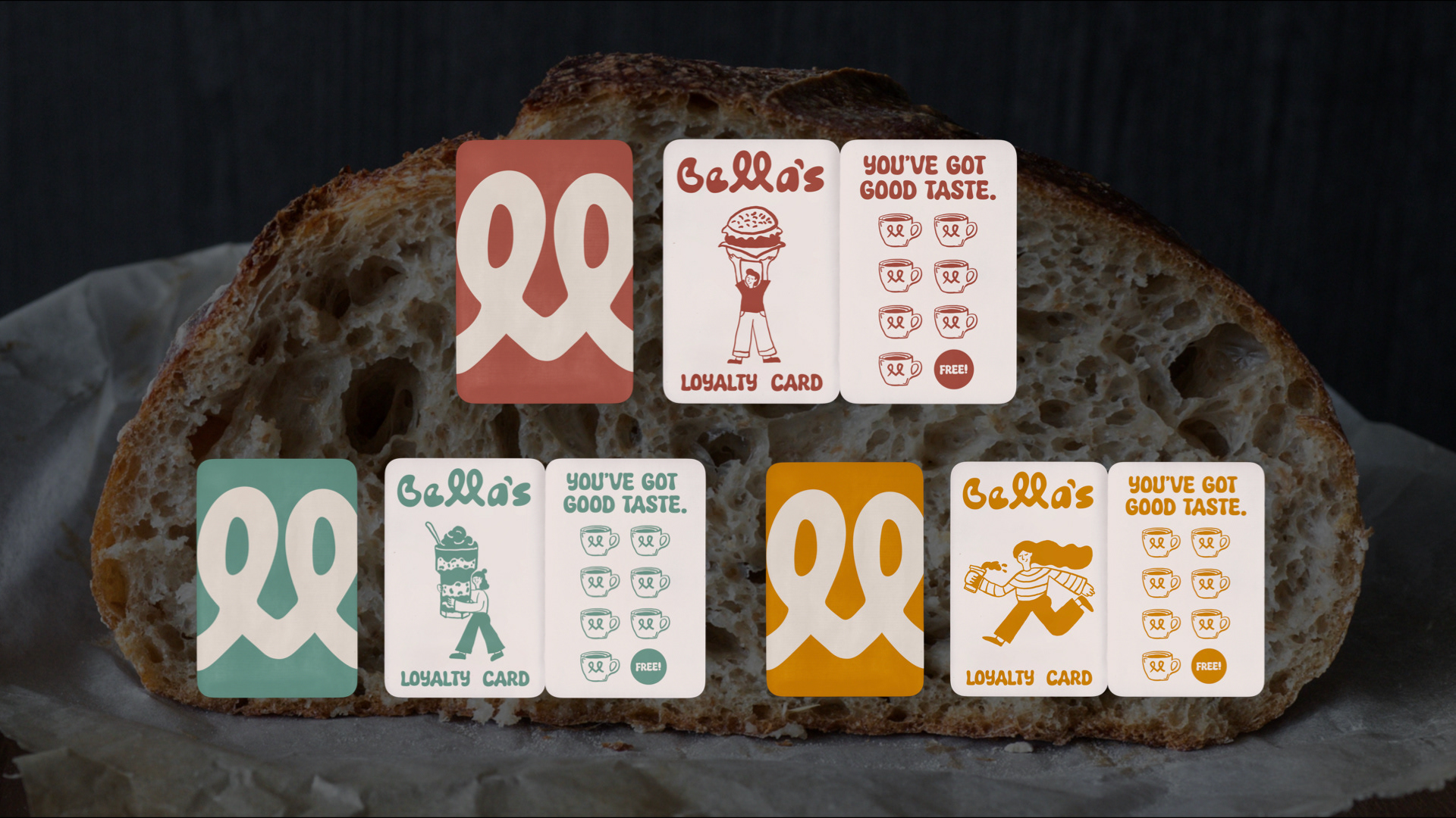
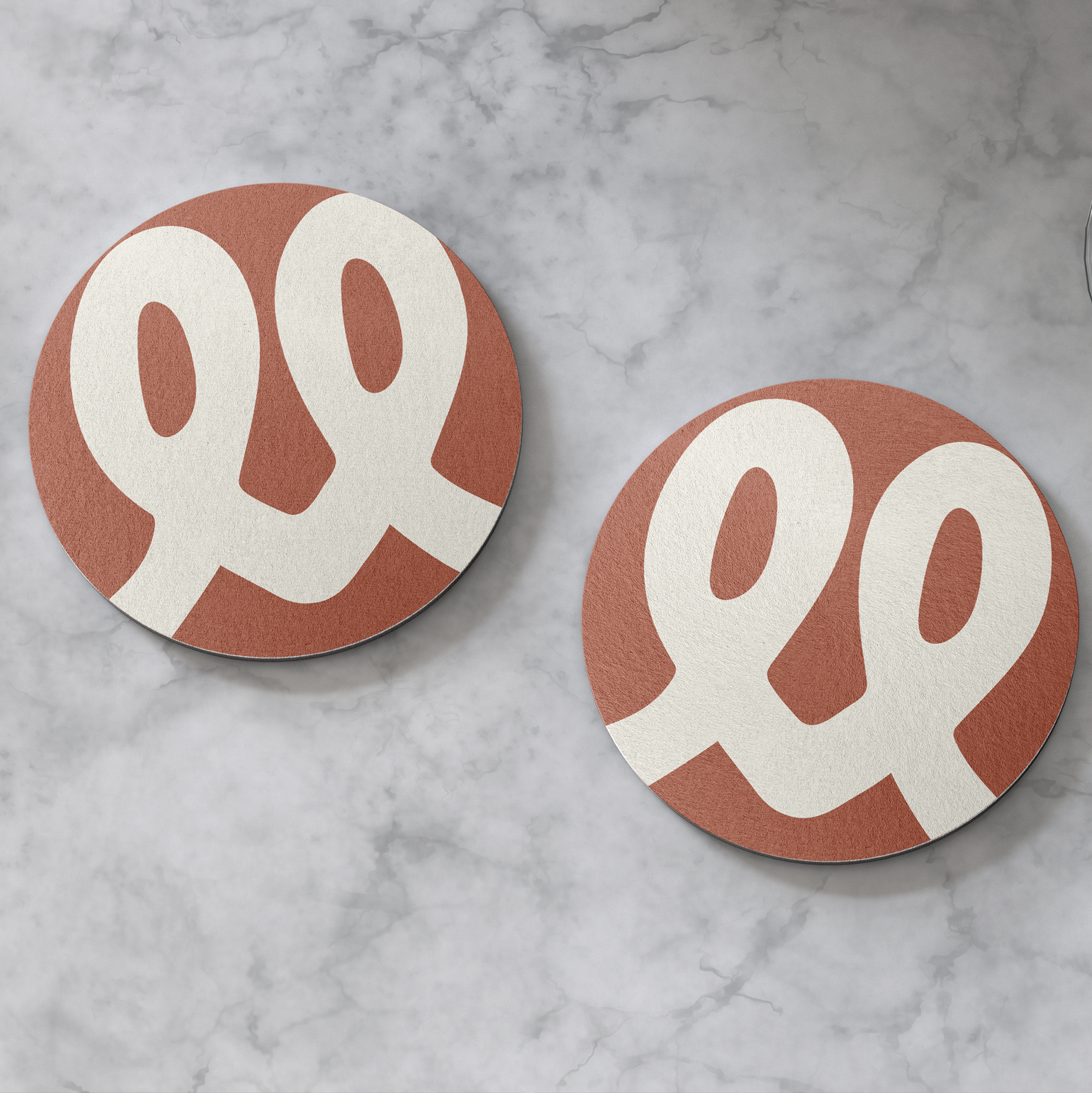
Pretzel heart: This is a shorter and quicker way to identify the brand which represents the love and care Bella’s gives to everything they put out for their customers.
Bella’s Café’s brand voice is present in everything we do, creating a sense of warmth, comfort, and creativity. It reflects the café’s welcoming and friendly atmosphere, making customers feel at home.
Our voice is warm, friendly, creative, and cozy, matching the café’s playful spirit. Above all, it’s approachable, fostering genuine connections and ensuring every interaction feels personal and effortless.
Bella’s Cafe consists of 4 swatches: Terracotta Clay, Sea foam Green, Sunshine, and Warm Ivory.
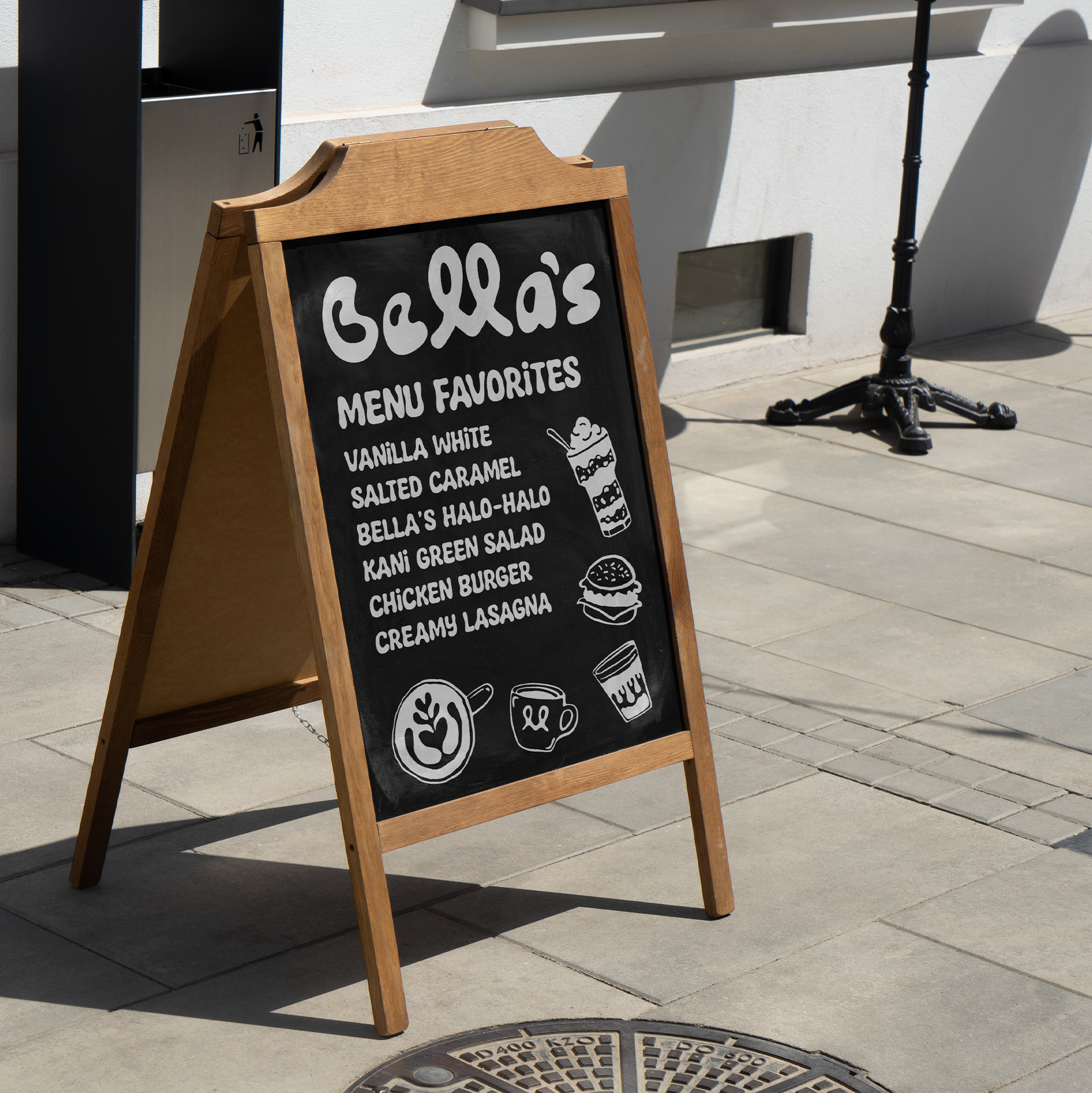
The illustrations are playful, warm, and simple, embodying the heart of Bella’s Café. They bring a creative and friendly energy to all touchpoints, from packaging to signages.
